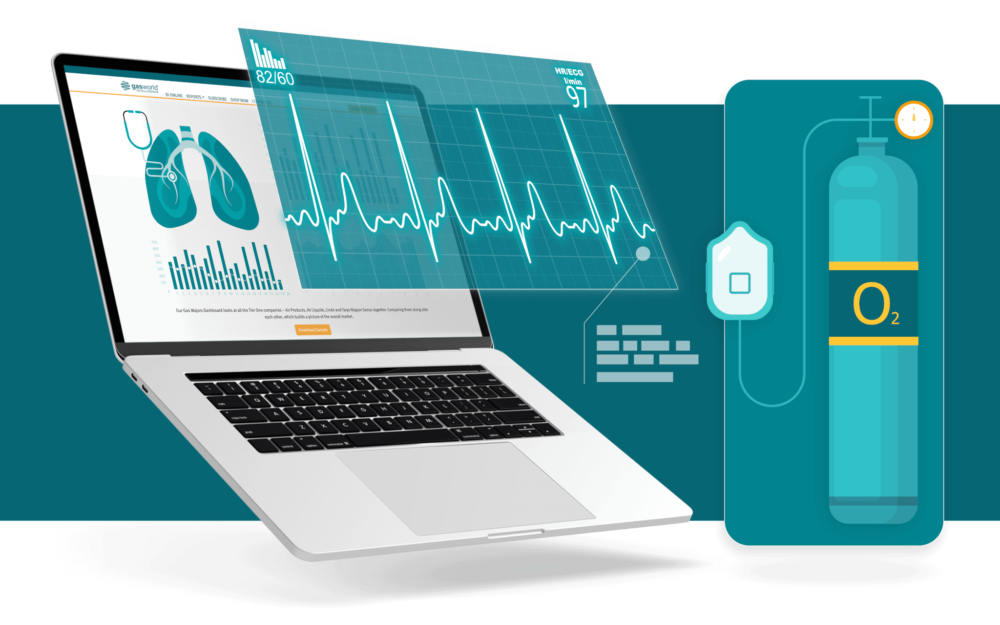
The Medical Oxygen Dashboard is filterable by region and country for targeted insights. Interactive charts unveil critical information, including whether a market faces oversupply or undersupply and the breakdown between liquid and gaseous oxygen demand. Additionally, historical and forecast charts provide visualisations for demand distribution across hospitals, homecare settings, and the impact of COVID on overall demand. A revenue-based bar chart illustrates the medical oxygen market size in each country, and a heat map further clarifies the geographic distribution of liquid oxygen production within countries. This comprehensive dashboard provides the critical intelligence you need to navigate the medical oxygen landscape and ensure a seamless supply chain.


These charts allow you to filter data by region and country, providing targeted insights. You can quickly assess whether a market is experiencing oversupply or undersupply of medical oxygen. Additionally, the dashboard breaks down the demand between liquid and gaseous oxygen. This interactivity enables informed decision-making.

Visualise the demand distribution across different settings, including hospitals and homecare facilities. These charts reveal trends over time, helping you understand the impact of COVID-19 on overall demand. Whether you’re analysing historical data or planning for the future, these visualisations provide critical context.

Revenue-Based Bar Chart: This chart illustrates the medical oxygen market size in each country. It’s a powerful tool for assessing market potential and identifying growth opportunities. Heat Map: The heat map further enhances your understanding by clarifying the geographic distribution of liquid oxygen production within countries. It highlights regions with significant production capacity and potential supply hubs.